Background \
Venza & Case is a Toronto-based online lifestyle boutique, offering high-quality accessories for personal electronic products in four major product categories: Phone, Tablet, Camera, and Laptop. The company is founded by two brothers, Viktor and Simon, raised in Toronto, Canada, who believe that the commitment in design and the focus on quality will build a brand that signifies creativity, beauty, and simplicity.
UX Vision \
The design objective is to create the e-commerce website that is able to deliver memorable shopping experience and to create customer bonding with the brand. 'It is like designing the interior for the physical storefront which would potentially allure people in and later tells their friends about'.
Year
2012
Timeline
3 Weeks
Lead, UX & Strategy, Art Direction
Adam Zhang
Visual Design
Adam Zhang, Kat Endo
BRAND VISUAL IDENTITY
The main objective of the visual identity is to emphasize and establish the name of the brand. It leads to a specific interest in developing a type-based logo - like the well-known classic lifestyle & fashion brands. The quest is to find the proper typeface which not only resonates with the brand's value but also practical to be applied to a broad usage context.

THE TYPEFACE \
The M+ family is a free font which contains a large group of font types, each comes with various weights and ready for digital display. The specific font types selected for the company's logo and the body font for the website are 'M+2M' and 'M+ 2C'. The combination is able to demonstrate a sense of modernism, as well as vintage and classic which captures the brand's value.

UX & STRATEGY
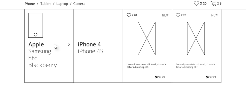
The basic UX goal is to make the website extremely simple to use and content-focused for the brand's non-tech-savvy audiences to turn straight to shopping mode, without distractions from a complicated process and excessive interaction. To achieve that, the team first studied the shopping journey from typical (and well-known) eCommerce sites and simplifies them into a process which only involved the necessary steps for one to complete a purchase transaction. However, the real challenge is how to design a memorable brand experience within such simple journey. The real design objective is to design the experience that is simple, but also able to leave the audiences with a memorable impression when exit.

THE PRODUCT DISPLAY \
The question is raised around 'what are the essentials of a store display design that makes it unique and memorable?'. For that, the team went out and discovered an interesting answer- The Product Display. For digital platforms, typical eCommerce website usually leverages heavy graphic content on the home page to attracts users' attention. But in the actual product display pages, most of them utilize the same generic grid layout without giving space or characteristics to the products themselves. Although the benefits are proven for many reasons, it is not going to help to create a memorable experience in many cases. 'How can we design the product display differently?' is the question followed. To find the answer, the team tried out a different approach which aimed to identify the design parameters with two essential goals in mind - instantly recognizable and memorable.
'Give them some space'
PHONE \

TABLET \

LAPTOP \

CAMERA \

SHAPE AND SIZE \

PHONE X4

TABLET X3

LAPTOP X2

CAMERA X3

VISUAL DESIGN

PHONE PAGE \

NAVIGATION \

TABLET PAGE \

LAPTOP PAGE \

CAMERA PAGE \

PRODUCT DETAIL PAGE \

